Google Ads is experimenting with a new look for campaign overview charts, and a few advertisers are already seeing it in action. The update leans heavily on visuals aiming to make campaign performance easier to read at a glance.
Here’s what’s different:
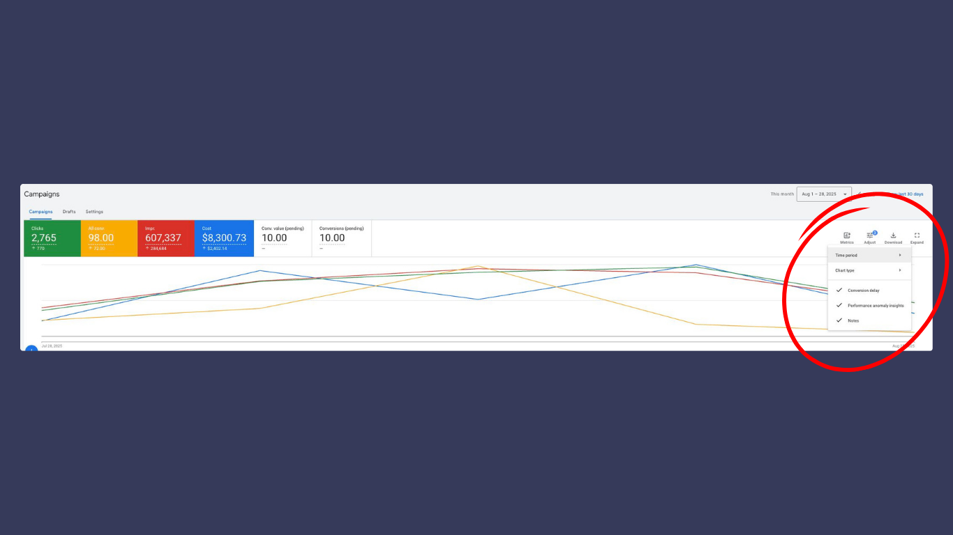
- Bigger metric boxes now sit above the charts so you can spot key numbers right away.
- A new “adjust” option lets you switch chart types and metrics with features like conversion delays, anomaly detection, and notes option.
- The overall design update feels cleaner and more flexible making trends and spikes stand out faster.
Why it matters: This change is all about speed. If you’re reviewing performance often, the new charts could help you find issues, opportunities, and trends without spending so much time digging through menus. It won’t reshape how campaigns run, but it should make tracking performance a little faster and easier.
If it’s not showing up in your Google Ads account yet, no worries. This update is still in beta and only a handful of accounts have access right now. Google’s just testing the waters, but odds are we’ll see it roll out more broadly before long.