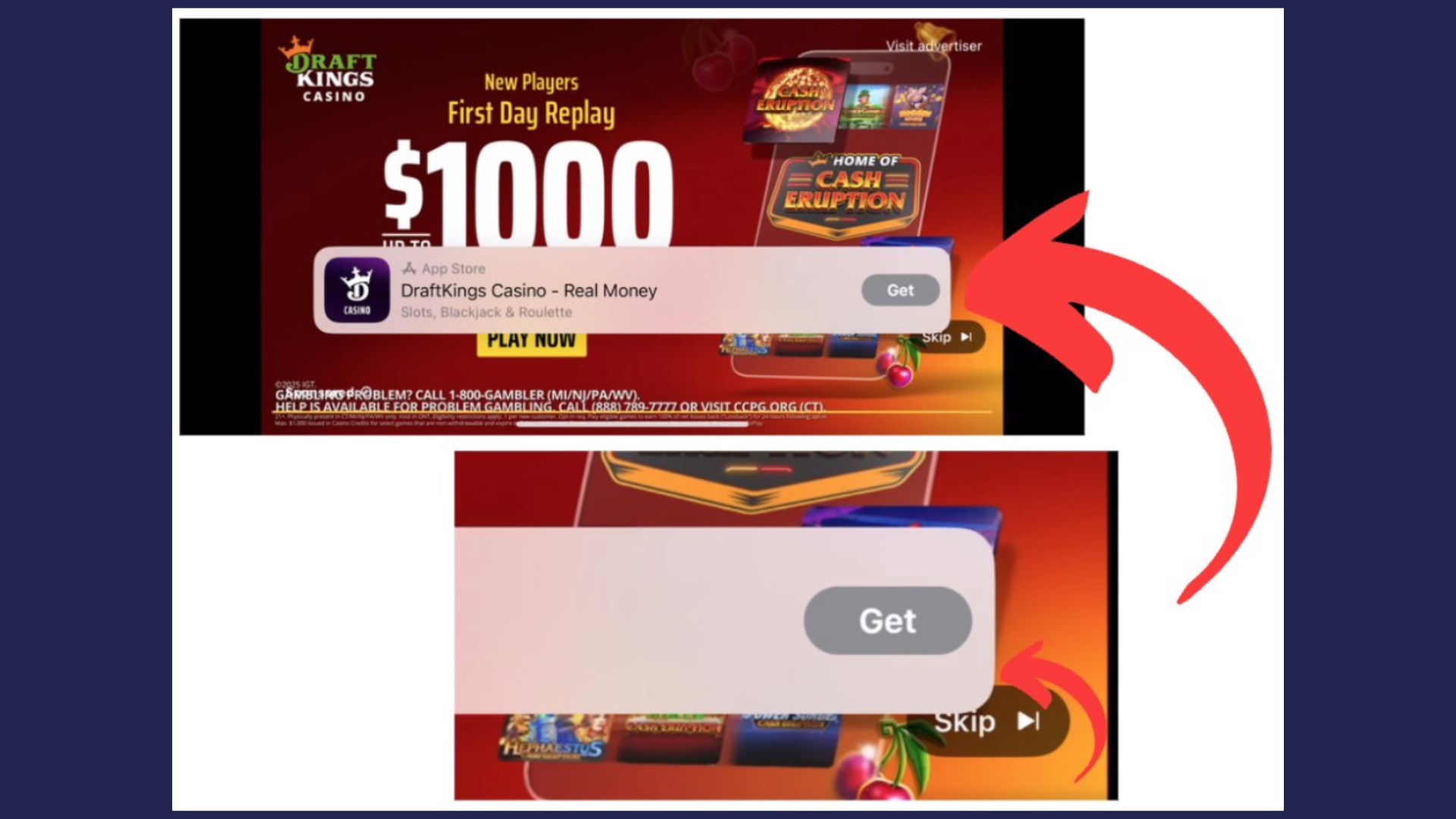
We’ve started seeing a new YouTube ad format that feels… familiar.
In this variation, the “Get” app overlay partially overlaps or crowds the “Skip Ad” button, creating a layout where the call-to-action sits very close to (or visually competes with) the skip option.
If you’ve ever encountered aggressive ad placements on questionable streaming sites, you know the type of tactic: place the click target near the exit button to increase accidental engagement.
To be clear, this is likely a UX test- not an attempt to mislead users intentionally. But the visual proximity is noticeable, and it changes the interaction dynamic.
Why This Matters for Advertisers
- Higher accidental clicks are possible – Overlay placement may inflate click volume without improving intent.
- Engagement quality becomes more important than CTR – If clicks rise but conversions don’t, the format—not the creative—may be the driver.
- User trust still matters – Aggressive ad design can create friction, especially for professional services like law firms.
- Creative clarity is key – If users do click, the message must immediately align with their intent.
Our take: YouTube is continuously testing ways to increase interaction rates, especially in mobile environments where screen space is limited. But as advertisers, we don’t want clicks “the wrong way.” We want intentional engagement from users who actually need legal help- not accidental taps.